JG Ballard


JG Ballard covers by timeline.


JG Ballard covers by timeline.
Typed by
Pedro Serrão
at
11:39 PM
115
comments
![]()
Labels: Graphic Design, History, Magazines
What are the letters made of?Alessandro tartaglia tells me to don´t miss the the new issue of FF3300 (219 pages, English and italian).
Typed by
Pedro Serrão
at
9:43 AM
15
comments
![]()
Labels: Fonts, Graphic Design, Magazines
TIME Magazine has been redesigned by Pentagram.
As Stengel says in the editor’s letter in the new issue, “This issue of TIME marks a new beginning. The magazine has a new look and structure. Every issue of TIME tells a larger story about the world we live in, and we wanted to create a design that would best present that story.”
“The magazine has been modernized,” Hayman agrees, “but it still has the TIME ‘DNA.’ We deliberately chose fonts and design elements that echo classic TIME magazine.” During the redesign process, Hayman worked closely with TIME’s in-house team, including Stengel, Hochstein and deputy art directors Cynthia Hoffman and D.W. Pine.
Paula Scher, who collaborated with Hayman on the redesign prototype, explained part of the thought process behind the project. “We created a system that we thought would resonate with today’s readers. It’s full of quick bits and relevant info, but still retains the spirit of TIME. We used the display typeface Franklin Gothic that was part of the history of the magazine, and revisited the grid used by Walter Bernard,” the legendary editorial designer.
Source: Pentagram's Blog.
Typed by
Pedro Serrão
at
9:35 PM
15
comments
![]()
Labels: Graphic Design, Identity, Magazines

Matt Micjaluk shows us A0 Magazine.
Each edition is a photographic journal of day trips to different destinations around Great Britain.
The magazine is made from 5 A0 photocopies which are then french-folded and stitched down the spine. the first edition photograped in western-super-mare has been blessed with fluro orange type.
The magazine is a collaboration with Adam Tickle, Alistair Webb and Kristina Grundberg.
Typed by
Pedro Serrão
at
12:01 AM
2
comments
![]()

Very worthy browsing material at LiveJournal community Douple Page, with lots of links to a variety of magazines.
Source: Maquetadores.
Typed by
Pedro Serrão
at
4:45 PM
5
comments
![]()

Good magazine has a great article on the *Smartest, Prettiest, Coolest, Funniest, Most Influential, Most Necessary, Most Important, Most Essential, Magazines.
Typed by
Pedro Serrão
at
3:46 PM
3
comments
![]()
Labels: Magazines

From Buenos Aires, Argentina, comes a great multi-disciplinary magazine:
Acido Surtido is a publication on art and design distributed for free in the whole country (Argentina). The first issue of Acido Surtido was published in 2001, as an answer to the lack of action and the downhearted feelings that was threatening the national cultural production in those days. Trying to take over collective construction common places, Acido Surtido opens itself to other voices, getting together in order to share. A kind of generosity is underlying: those who offer the place, those who give their work, those who receive it and make its sense. There are some other principles. Avoiding commercialization and production paraphernalia that could make its cooperation spirit strange and move towards massive circulation. Betting on the quality of its contents secretly hoping to achieve fulfillment. In a nut shell: find the difficult balance between a high level publication and a self-produced fanzine.


Read this nice interview at SpeakUp with the Art Director of METROPOLI, Rodrigo Sanchez, that recently won a Type Directors Club award.
Rodrigo joined El Mundo in 1992, where he is the Art Director of three of the newspaper’s supplements along with other tasks required by the large publishing group. Since graduating from Universidad Computense de Madrid, Rodrigo has been working in the editorial field: The finance magazine Mercado, was the first job that offered him design control; he then joined El Sol in 1990 where he met legendary editorial designers Roger Black and Eduardo Danilo (of Danilo Black) whom he credits for opening his mind (and doors) to editorial design of the highest quality. For the last 15 years Rodrigo has been producing covers for Metrópoli that defy normal design routines and display a wonderful range of visual executions that range from the expected to the short-of-breath-magnificent.


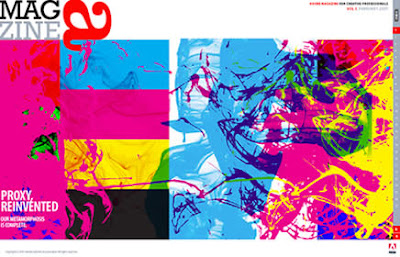
Adobe Magazine is dedicated to helping users of Adobe products get their work done better and faster, and to entertain, educate, and inspire them along the way.
Get it here.
Typed by
Pedro Serrão
at
10:28 PM
1 comments
![]()
Labels: Magazines
Submission criteria
We’re looking for design projects where typography is used as the primary visual element. The work must be recent (within the last two years) and should not have been previously shown in one of our annuals or the Exhibit section. There is no cost to submit entries for consideration in the Visual Typography feature.
Submission material
Please submit the actual printed package, digital file or hard copy printout.
Please include a brief description of the project, along with contact information, including an e-mail address. If your project is selected, we will contact you for reproduction materials and complete creative credits.
Submission deadline
Submissions must be received no later than Thursday, February 1, 2007
Typed by
Pedro Serrão
at
9:38 PM
1 comments
![]()
Labels: Competitions, Fonts, Magazines

If you´re a fan of magazine covers like I am, you´ll love this resource.
Clip/Stamp/Fold is an amazing researh and collect work by a team of Ph.D. candidates at the School of Architecture at Princeton University:
An explosion of architectural little magazines in the 1960s and 1970s instigated a radical transformation in architectural culture with the architecture of the magazines acting as the site of innovation and debate. Clip/Stamp/Fold: The Radical Architecture of Little Magazines 196X – 197X takes stock of seventy little magazines from this period, which were published in over a dozen cities. Coined in the early twentieth century to designate progressive literary journals, the term “little magazine” was remobilized during the 1960s to grapple with the contemporary proliferation of independent architectural periodicals. The terms “little” and “magazine” are not taken at face value. In addition to short-lived radical magazines, Clip/Stamp/Fold includes pamphlets and building instruction manuals along with professional magazines that experienced “moments of littleness,” influenced by the graphics and intellectual concerns of their self-published contemporaries.
Update: Also check out Colophon2007 and Magculture

Spatium magazine has a new issue for sell at their shop: “Hamburgefonts”.
The magazine contains articles about type specimens in general, dummy texts, type specimen index cards and a report about our workshop “Presenting type at its best”.
But more than this, Catherine Dixon contributes with an article about the history of type specimens, Oded Ezer sent us pictures of Hebrew type specimens and Robert Schöne of Chinese ones, Daniel Janssen informs about the Holzlettern Manufaktur (Wooden Type Manufactory) Hamburg and Jürgen Siebert from FontShop gives a summary of the FontBook's “making of“.
2 brochures, 68 pages printed orange/blue and 36 pages printed CMYK, format DIN A4 (210 x 297 mm / 8.2 x 11.6 inch).
Typed by
Pedro Serrão
at
3:09 PM
1 comments
![]()