New blog
Hello!
From now on, typeforyou blog will be at www.typeforyou.org.
See you there! ;)


Going shopping, or drinking type? Confused? Ok, you can see the video in, http://www.out-of-paper.ch

Great work from Chris Thompson, recently graduated from the glasgow school of art.
Lovely posters!

Book by Mike Perry.
Check out the typography section on his site. Very nice work.

Matrix II
A redesign by Zuzana Licko
Matrix II is a complete reworking of the Matrix type family which was originally designed by Zuzana Licko in 1985. The redesign, which started in January 2007, was initiated by the need to create an OpenType version of Matrix. With the hood open, so to speak, Licko used the opportunity to make subtle changes and to fine tune many of the existing characters which were designed some 20 years ago. The contrast between thick and thin strokes was decreased in some instances, and overshoots were corrected. The width of various characters was adjusted and regularized. The cross stroke on the f was simplified on most weights. The design of the lower case g was revisited and an alternate single story version was designed and added to the OpenType version. Seven new fonts were also added to the family: a Semi Narrow, Semi Wide, Semi Tall, Inline Italic, and 3 weights of Italic - a less flamboyant version of Matrix Script. To clearly set this version apart from the original Matrix, and to avoid conflict with previous versions, its name was amended to Matrix II.
To read the full story behind the design and redesign of Matrix, please visit our website:
http://www.emigre.com/EFfeature.php?di=105


Tobias battenberg, from Germany, made a nice experiment with video projections in several buildings and structures in the city, about the font "akzidenz grotesk".
Akzidenz grotesk is known as a font that tolerates a lot, that holds out a lot - my plan was to get a proof by the font herself. the font demonstrated her character at its best.
Very nice, take a look.


Meek FM is an interpretation of type as sound. Using new software and the M.E.E.K. typographic synthesizer, the musician/designer develops sounds and typographic visuals in parallel. Meek FM will be premiering as an interactive installation at the Typo2007. The Meek FM team will also perform live at the Festival event.


Stephanie DeArmond makes beautifull ceramics.
(Thanks to Valdemar for finding it.)

The Musalman is possibly the last handwritten newspaper in the world. Four professional calligraphers spend three hours on each page every single day to put out this daily paper.
Source: Wired
Thanks Valdemar!

Mark Boulton has a nice article over on his blog on incremental leading.
Also, don´t miss ‘Compose to a Vertical Rhythm’ from Richard Rutter, and the article on Baseline Grids, from a List Apart.
Source: Mark Boulton
Paula Scher, finalist of the National Design Awards for 2007 in graphics, shows how the type can be image, check it out.

For you in London, don't miss the Letterpress Matters exhibition and workshops, 3-7 July 2007 at Camberwell College of Arts:
It is no coincidence that type was traditionally referred to as matter. In a time when the last generation of professionally-trained compositors are retiring, Letterpress Matters, as part of the Postgraduate Summer Show 2007 at Camberwell College of Arts, explores the inherent material nature of letterpress and celebrates its new possibilities in our ever more digitally-engaged contemporary culture.
...
The integrity of letterpress lies in its material and physical process. Therefore, involving the audience as much as I myself am involved in the hands-on printing process is crucial. So come and join a guided tour of the letterpress workshop at our very own Camberwell College of Arts. With the rich history of the Camberwell Press and the technical expertise of Ian Primarolo, the letterpress workshop is now a rare and inimitable place.
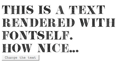
This is pretty interesting... Computer generated text, using a digitized manuscript font. The results are great and very beliveable:
FONTSELF is a type project about handwriting and drawn writing.
It provides the ability to create fonts that preserves the gestures of a given handwriting and the original look of the drawing appliance (ball-point pen, pencil, ink, paper, etc.).
FONTSELF proposes intuitive tools to create and edit bitmap font (scanned letters) as well as solutions to use them and exchange them.
You can even render a live news feed.