Spiekermann interview

Nice interview over at ideiasonideias.

Nice interview over at ideiasonideias.
Typed by
Pedro Serrão
at
2:58 PM
20
comments
![]()
Labels: Designers, Interviews, Profile, Resources

One of Baltimore's most known indie design duos, Post Typography are a hidden gem in Baltimore's wasteland. Designing posters for events, concerts and exhibits all around the city, you most likely have stumbled by one of their posters if ever in Baltihood. Not only that, but they are also musicians who play some crazy freakin music. We caught up with them and asked a few questions to find out what's going on with them lately.
Read the interview over at Profile Magazine from YWFT.
Typed by
Pedro Serrão
at
4:31 PM
19
comments
![]()
Labels: Designers, Interviews

At Manage this:
This year at the Macworld Conference and Expo, we hosted a number of expert font panel discussions at our booth on the show floor. The discussions turned out quite well, and for those of you who were unable to make it to the show, we’re happy to report that we recorded everything! This first panel titled “The Art of Type” focused on type, and more specifically type design. Extensis Product Marketing Manager Halstead York hosted Adobe product manager Thomas Phinney and FontShop font evangelist Stephen Coles for this panel discussion. We asked these experts a number of questions that were posed by our readers, right here on the Extensis blog. The discussion is broken up into a number of smaller audio files so that you can easily skip to sections that are of interest to you. If you’d rather listen to the discussion in it’s unedited form, scroll down to the bottom of this post. Be sure to stop back by the blog, as we will soon be presenting the audio from our other panel discussion that focused on working with type in design applications.
Typed by
Pedro Serrão
at
12:11 PM
2
comments
![]()
Labels: Designers, Events, Interviews


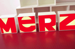
The typography was originally based on Franklin Gothic, over 100 years old and still looking as fresh as a daisy. Strong, solid, clear, no messin’. Then it was a matter of getting it flowing together smoothly, focusing on the shapes of each character and almost morphing them into each other so that it wasn’t just four independent letters but one seamless sculptural piece. This involved a lot of squinting and standing back until it felt right.
This is an example of what you can find at Brand New, a Speak Up spin-off displaying opinions, and focusing on corporate and brand identity work. It is a division of UnderConsideration.
Typed by
Pedro Serrão
at
11:21 AM
2
comments
![]()
Labels: Fonts, Identity, Interviews, Resources

There is a nice interview at MetropolisMag with Markus Rathgeb, author of a monograph on Otl Aicher, graphic designer for the 1972 Munich Olympics.
Via Design Observer.
Typed by
Pedro Serrão
at
8:29 PM
5
comments
![]()
Labels: Books, Designers, History, Interviews
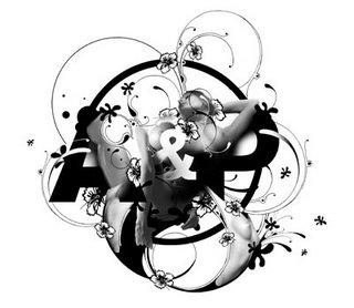 Si Scott
http://www.siscottdesign.com
Who is Si Scott? Tell us a little about yourself?
I am a graphic designer from the Uk who is originally from Leeds but has moved around the country quite a bit (the next plan is to spend some time living abroad hopefully New York or somewhere like that). I left school at 16 and went to Leeds College Of Art & Design (Where I am now a part time lecturer) to study a BTEC in Graphic Design and then a foundation in Visual Communication, before going to Buckinghamshire Chilterns University to study a degree in Graphic Design. Upon completion I stayed in London for another 2 or 3 years and worked for a number of different small designa gencies whilst continuing with my own work and freeelance projetcs on the side.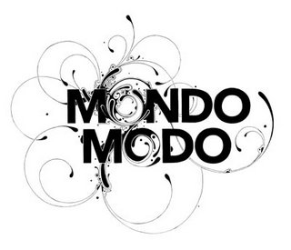
You've been making some really innovative type work. Describes us your process and how you've come to make this kind of work.
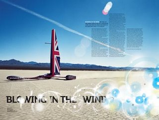
I always start by picking a font I feel fits the brief or works with what I am trying to achieve the piece and then will play around with different page layouts for a while. The next pahse is to just bring the piece to life using fineliners to create the illustration. I always work bigger than the finsihed piece is going to be and scan the illustrations at 1000dpi at 125% so when it is decreased to the actual size it's very crsip an clean.
I think I came to make this kind of work just through my love of drawing, type and design and trying to do something that encompasses all them together.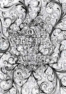
This is a typical question, but none the less: Where do you get your inspiration?
Most of my inspiration comes ffrom music - I am constantly listening to music while I work and the lyrics especially. I'm really into words!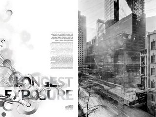
You have just created "We are bitch" with Kerry Roper. How come you got to work with him, and when have you decided to create this already promising studio?
I've known Kerry quite a few years now from my days of living in London. We just became mates and always said we'd do something together. So we decided to set up a studio together - we are both really busy with our own stuff at the minute which means unfortunately we haven't had time to really concentrate on 'We Are Bitch' - hopefully we'll get a chance to work together a bit more in the future.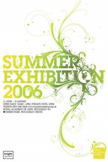
And to conclude, name three of your favorite fonts.
Helvetica (family)
Akzidenze Grotesk (family)
Pagan Poetry
and too many more to mention.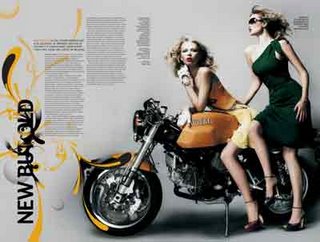
www.siscottdesign.com
www.wearebitch.com
(typeforyou team would like to thanks Si Scott for his time)![]()
Typed by
Anonymous
at
11:07 AM
255
comments
![]()
Labels: Interviews
Andrea Tinnes
http://typecuts.com/
Tell us a bit about youself?
I will start off with some basic facts:
I'm 37, born in 1969.
I studied communication design at the Academy of Applied Science in Mainz - the city of Johannes Gutenberg. In 1996 I received a scholarship to continue my studies on graduate level; I moved to California to attend the graphic design program at the California Institute of the Arts and received an MFA in 1998.
I have been working as independent graphic and type designer since 1999.
In 2004 I decided to start my own label named typecuts as a platform to promote and publish my type designs as well as my graphic work.
I have a hybrid practice which is on the one hand focused on client-based as well as self-imposed projects. On the other hand I teach courses in type and typography in the design department at the Bergen National Academy of the Arts (KHiB) in Norway. It's a 20% position which allows me to combine my practical work with academic discourse.
I have made a conscious decision to be one-woman studio, so I try to keep everything small and manageable and leave beside enough room for the design of new typefaces and my teaching commitments.
Maybe some words about the name »typecuts« which is a versatile name implying various meanings:
The term »typecut« refers to the old tradition of type-cutting as well as to my process of designing type - I don't really draw but rather »construct« the »skeletons« and »bodies« of my faces and I do cut and paste modular elements (even though I always refine the curves and add details).
And if you literally translate »typecut« into German it's »Schrift Schnitt« which means »single weight«, like they used to cut every single weight in metal type.
There is of course also the reference to »haircuts«, »shortcuts«, »clicks and cuts« etc.....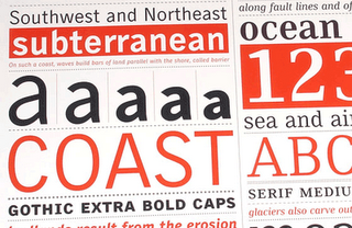
When have you became interested in designing typefaces?
It wasn't before graduate study at CalArts that I truly became interested in designing fonts. It was especially Jeffery Keedy (his type design course and later my work as his design assistant) who introduced me to the discipline of type design along with the work of W.A. Dwiggings and the calligraphy of Georg Bocskay.
With a growing experience in design I also wanted to have a better control of the entire design process: to be able to create all visual elements myself (also for self-expression): from the micro parts such as type to the macro parts such as illustration and photography.
What really attracts me in type design is the challenge of working within the constraints of supposedly static, precisely defined shapes, respecting the laws of latin letterforms, balancing cultural conventions with individual expressions. It's quite fascinating how minimal alterations like variations in weight and space, straights and curves, starts and finishes, ascenders and descenders can have a maximum effect.
Could you discribe us your process of making a typeface?
I usually start with sketching some key lowercase characters, such as the »n« »h«, »b« and the »o« to explore my initial design idea, to test various details and to set all important parameters like weight, x-height, ascenders, descenders and metrix.
I continue with all the letters needed to set the word »hamburg«, then it's about adding letters, printing out single words in small as well as large pointsizes, correcting details, setting paragraphs, correcting again and again, refining details, adjusting spacing, adding kerning for all important kerning pairs (between 2000 and 3000 pairs, depending on the typeface) and so on.
As for the time involved to create a typeface it really depends on the project; the final version of PTL Skopex for instance is the result of almost 6 years of work. This doesn't mean that I continuously worked 6 years on it, but from the initial sketches and its first release as custom font family in the year 2000 it has gone through many phases of modifications, alterations and extensions. In 2004 Skopex was customized for the new identity system of the Minneapolis College of Art and Design (MCAD) and in 2005 I added many new weights, including caps and expert sets and revised all the kerning for its upcoming release by the fontlabel primetype.
One reason for this long process was definitely my inexperience with the design and production of such an extensive font family. The more I worked on it the more I learned about typedesign and the more I noticed certain mistakes and details that needed to be adjusted.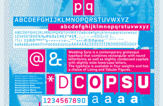
Where do you get inspiration?
I draw inspiration from any aspects of visual culture: signs and alphabets, street art and hand painted murals, pop and kitsch, visual poetry as well as commercial art, psychedelia as well as minimalism and so on.
I do collect and archive all kinds of design ephemera: from historical type specimens and type catalogues, over historical design magazines, maps, lexicas and science books to contemporary flyers, broschures, packagings, etc. and I document (through photography) all kinds of typographic artefacts within the everyday life graphic landscape.
There is also music, film, art and literature and of course critical feedback, dialogue and debate.
Another important influence and inspiration for my work is my education at CalArts as well my former work for Jeffery Keedy at his typedesign studio »Cipher«.
CalArts had a strong impact on my definition of graphic design and my perception as graphic designer and it still informs very much my approach to design: to combine critical thinking with joyful formmaking, to develop my individual voice and style and to reflect history while exploring new ideas in the field of visual communication.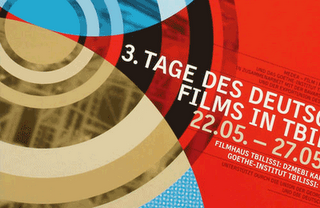
Talk to us about your work for Medea and the Goethe Institute around German film festival in Tiblissi.
Medea (Georgian-German film production company with headquaters in Tbilissi and Cologne) was founded by Irina Kurtishvili from Georgia and it is basically her passionate project to foster the cultural exchange between Georgia and Germany, between the east and the west. Together with the Goethe Institute Medea founded the German Filmfestival in Tbilissi in 2002 (and it’s been taking place since then). The Festival features contemporary German films, actors and directors.
Here I see my role as mediator between two cultures and with my design work I engage in the mutual cultural exchange. Each year I’m faced with the creative challenge to combine two entirely different language systems: the latin and the georgian alphabet.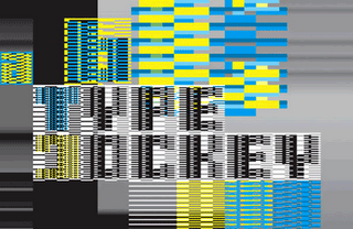
You worked with Martin Perlbach in the Volvox project, could you describe us that project and where you get that idea?
Volvox is a system of 5 fonts, each font with a set of 26 illustrations, that can be combined and superimposed.
If you step and repeat the letter »A« five times for instance and set it consecutively in Volvox 1, 2, 3, 4 and 5 you will get one ornamental composite (that’s been designed as an entire form).
However since all the shapes are concentrically composed - which means they all share the same width as well as the same centre - you can create an endless variety of combinations.
I created Volvox over a long period of time; the idea of a font system wasn’t there at the beginning. It started out of my special interest in organic forms; I was influenced by various sources: biology books and lexicons as well as D’Arcy Thompson’s »On growth and form«.
However the greatest inspiration came from Ernst Haeckel’s beautifull illustrations of jellyfishes, sea urchins, corals, sponges and radiolarians in his monograph »Art forms in Nature« with the question how to re-interpret his highly decorative and aesthetic drawings of nature with a contemporary visual language.
About the Volvox interactive application, Martin Perlbach a flash programmer working next door to my studio space, was very fascinated by the forms of Volvox and he offered to program an application where the user can playfully interact with Volvox to create all kinds of Volvox composites while assigning color, size, transparency as well as speed and direction of rotation. We developed the concept for the application together and then he did all the programming and created this wonderful visual tool.
And to conclude, name three of your favorite fonts.
There are so many beautifull type designs and letterings, historical as well as contemporary ones; to name only 3 of them would leave out too many aspects of type design I'm very much interested in.
Thank you! :}
(typeforyou team would like to thanks Andrea for her time)
Typed by
Anonymous
at
12:55 PM
64
comments
![]()
Labels: Interviews