Brand New


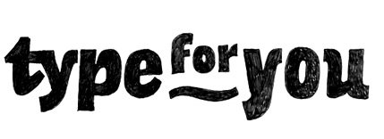
The typography was originally based on Franklin Gothic, over 100 years old and still looking as fresh as a daisy. Strong, solid, clear, no messin’. Then it was a matter of getting it flowing together smoothly, focusing on the shapes of each character and almost morphing them into each other so that it wasn’t just four independent letters but one seamless sculptural piece. This involved a lot of squinting and standing back until it felt right.
This is an example of what you can find at Brand New, a Speak Up spin-off displaying opinions, and focusing on corporate and brand identity work. It is a division of UnderConsideration.


6 comments:
Wow... Great work!
FElipe
Buy Cialis
----------------------------------------------------------------------
Acomplia
----------------------------------------------------------------------
Generic Viagra
I found you and your blog site.
I was looking for a search engine.
I must thank you for the efforts you’ve put in writing this blog.
I am hoping to view the same high-grade blog posts from you later on as well.
Post a Comment